The second our cars gain the ability to drive all by themselves, the need for a traditional dashboard will go away.
It’s been said before that future cars will be more media-focused inside, rather than focused on functionality, since there will be no need for them to have physical buttons and switches.
This means that the gauge cluster will most likely join with the main display to form a large screen for media, navigation, settings and so on. Mercedes is already toying with the idea, even though their format is still a traditional one with gauges in front of the driver.
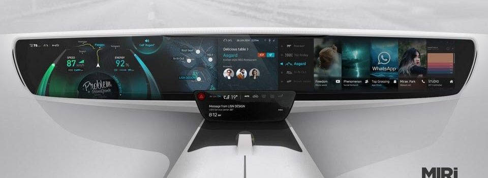
Now, what you’re looking at in these images, is the MIRi UX by one Jason Kim. As you can see, the main display is one gigantic piece, seamlessly split in multiple sections.
For example, on the left (apparently it’s a LHD car), you’ve got your speed indicator, odometer, range, route guidance and cruise control settings, plus whatever song you happen to be listening to. To the right of that is a large map that occupies the same space as the media section where you can watch your favorite TV show.
As for the other side of the giant display, that seems to be the “app drawer”, where you can check out your social media, download more apps, use the phone and more. Finally, beneath everything there’s a smaller screen that features climate control functions, a possibly physical hazard lights button and other important information.
Interestingly, the date on the display says June 26, 2024, which is probably hopeful thinking for this type of advanced technology.


